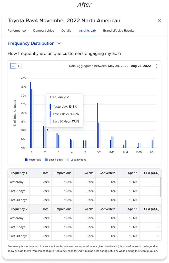
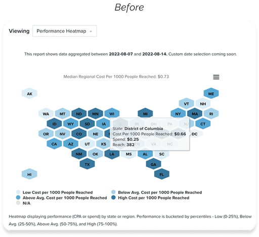
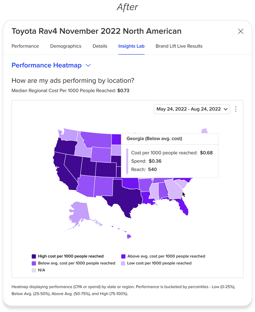
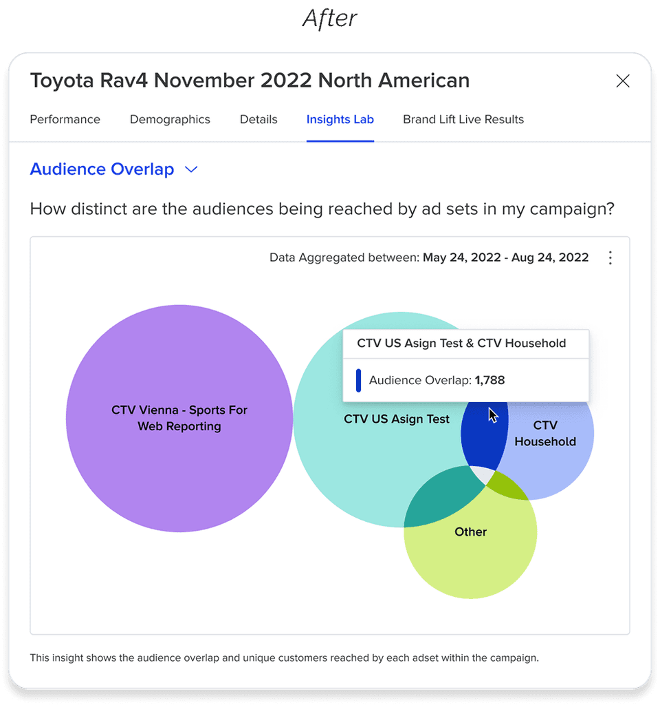
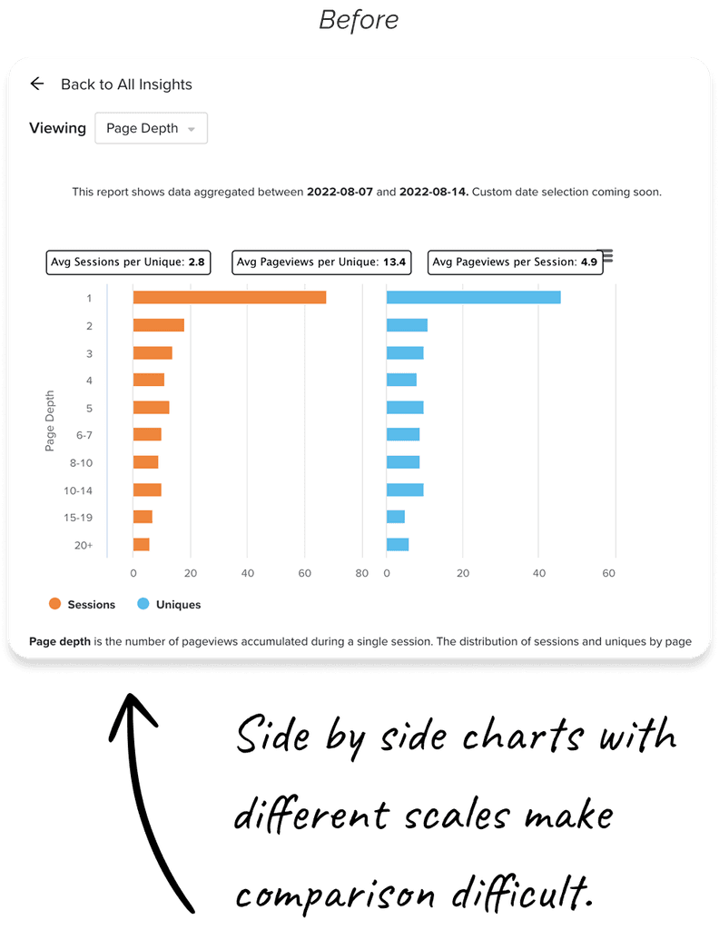
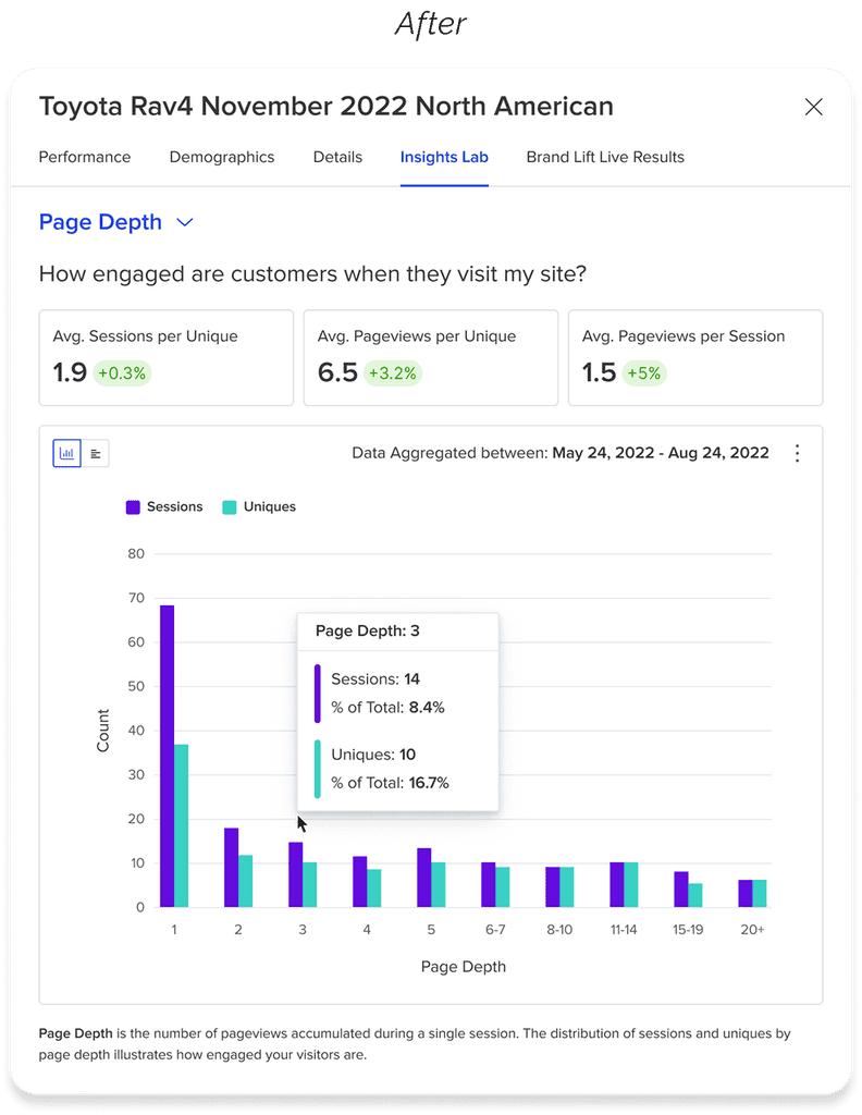
Data visualization to measure customer engagement
I redesigned Quantcast's data visualization language to improve readability, helpfulness, and brand identity of the insights product.
Lead designer
Quantcast
Web application
Strategy, UI design
Challenge
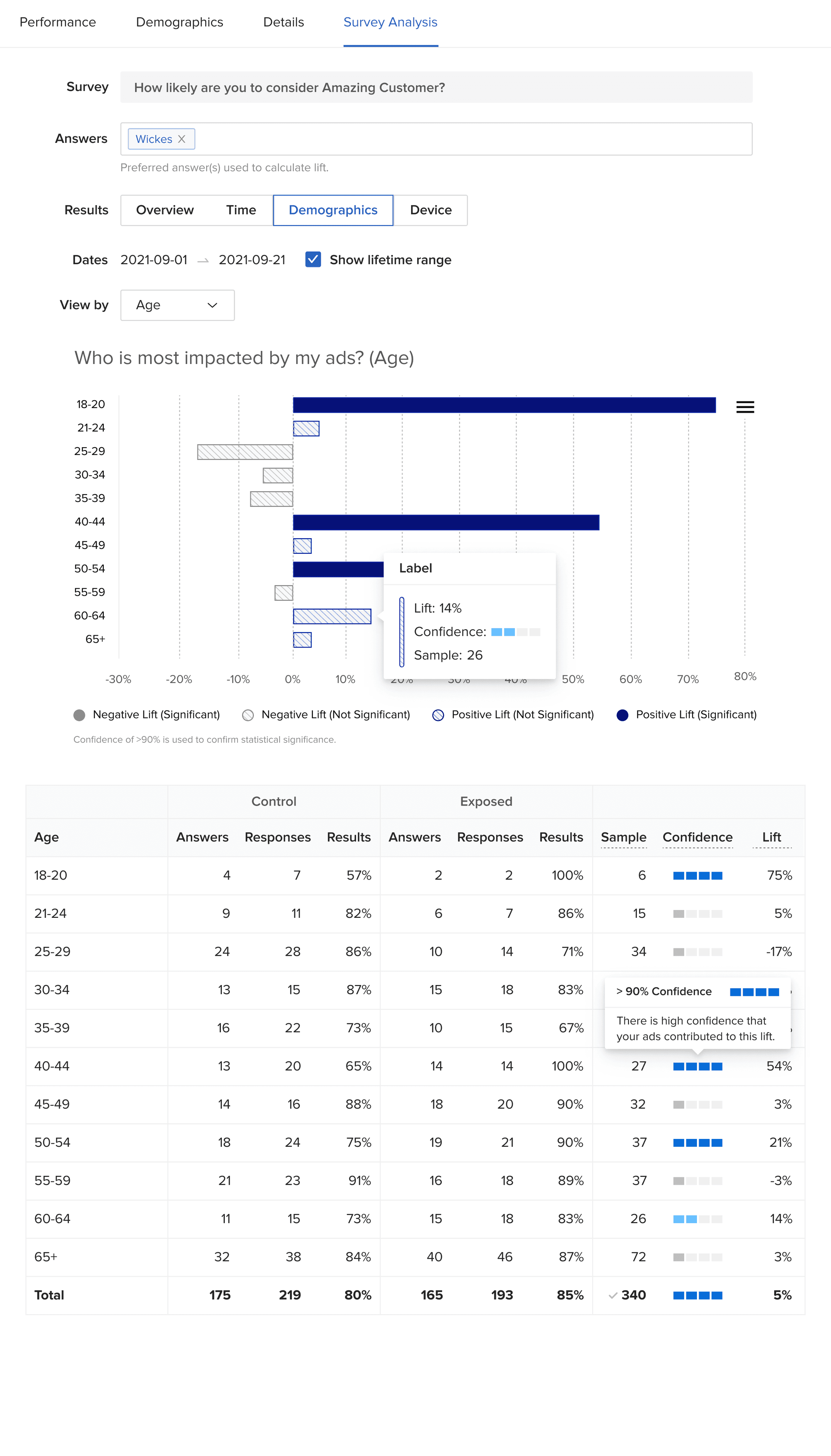
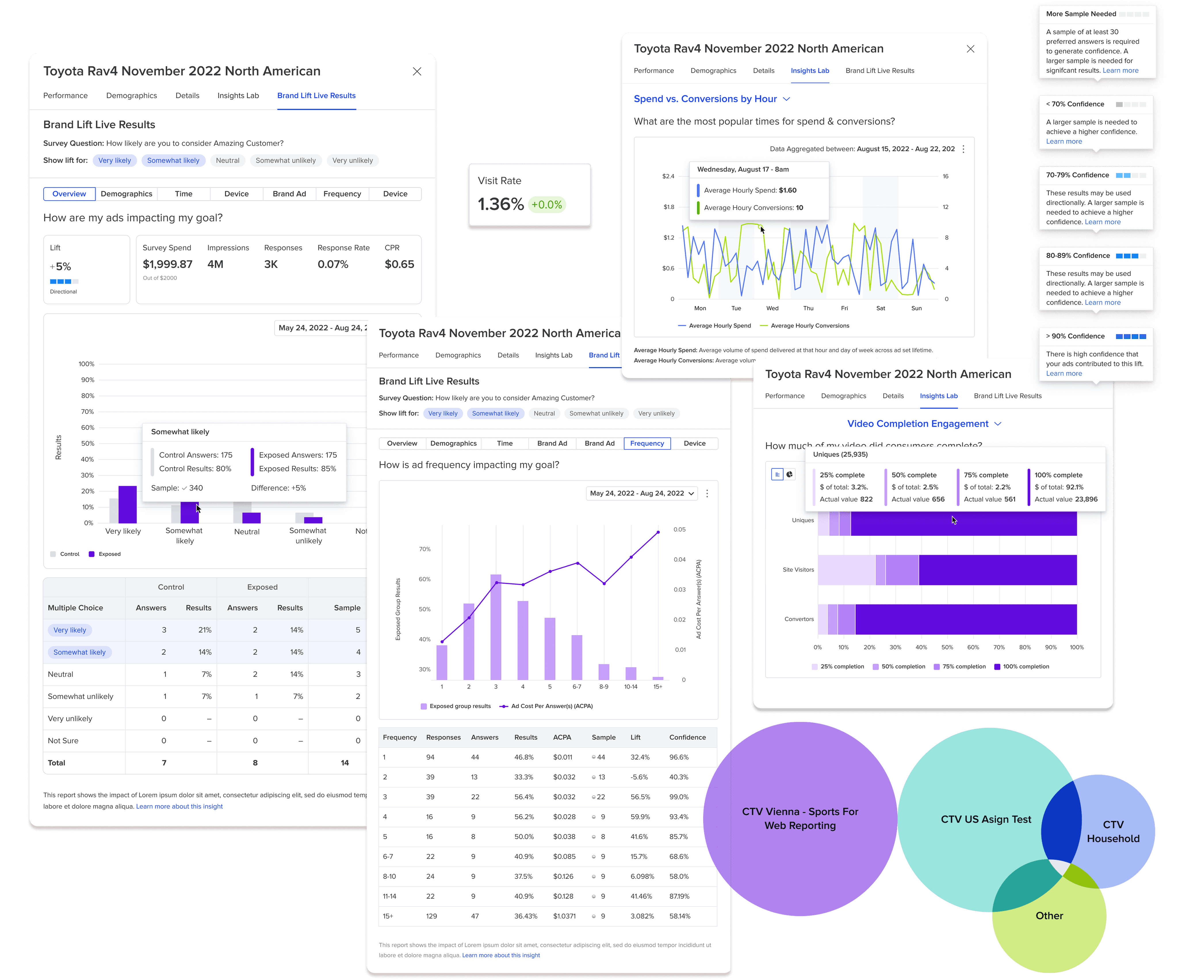
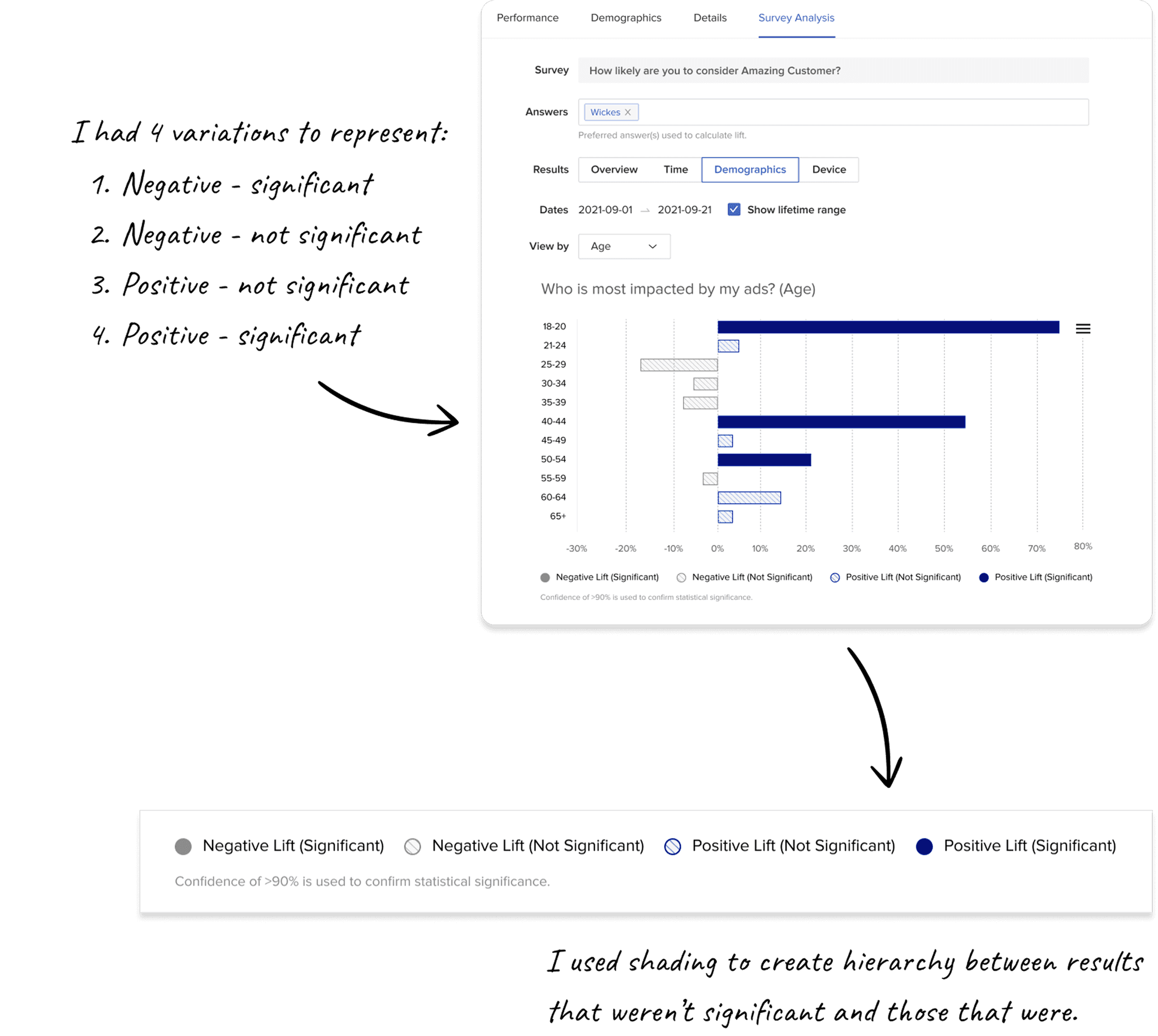
Designing for user-friendly stat sig
Quantcast was launching a product where clients could run A/B tests to evaluate the impact of their ads.
The new product would show whether an ad had positive impact (i.e. “brand lift”).
Most of our clients didn’t have strong opinions or knowledge on the significance level needed to trust the results, so they relied on us to help them interpret the data.
Exploring confidence, significance, and sample size relationship visualization
The initial idea was to include confidence in a top-level KPI card, where we’d have more space (hence the arc and dial explorations). But as we explored how to continue this language across cards, tooltips, and tables, it became clear that we’d need something that could fit inside a cell of a table (further below).
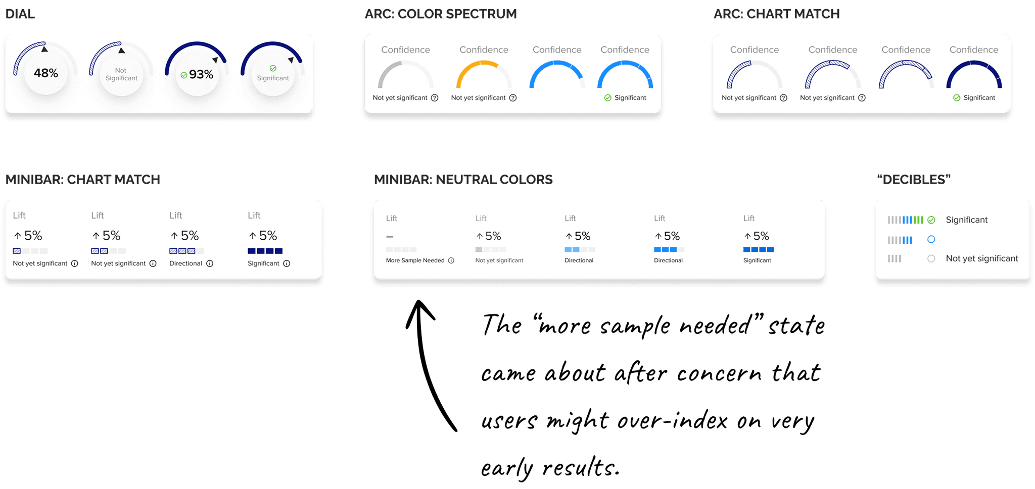
Lots of debate and discussion went into how many confidence segments we should have, and how to visually communicate the point at which users could trust their data.
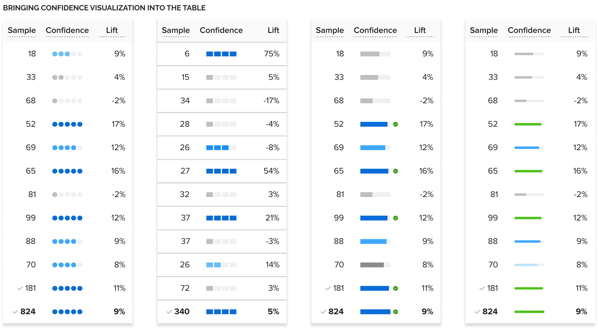
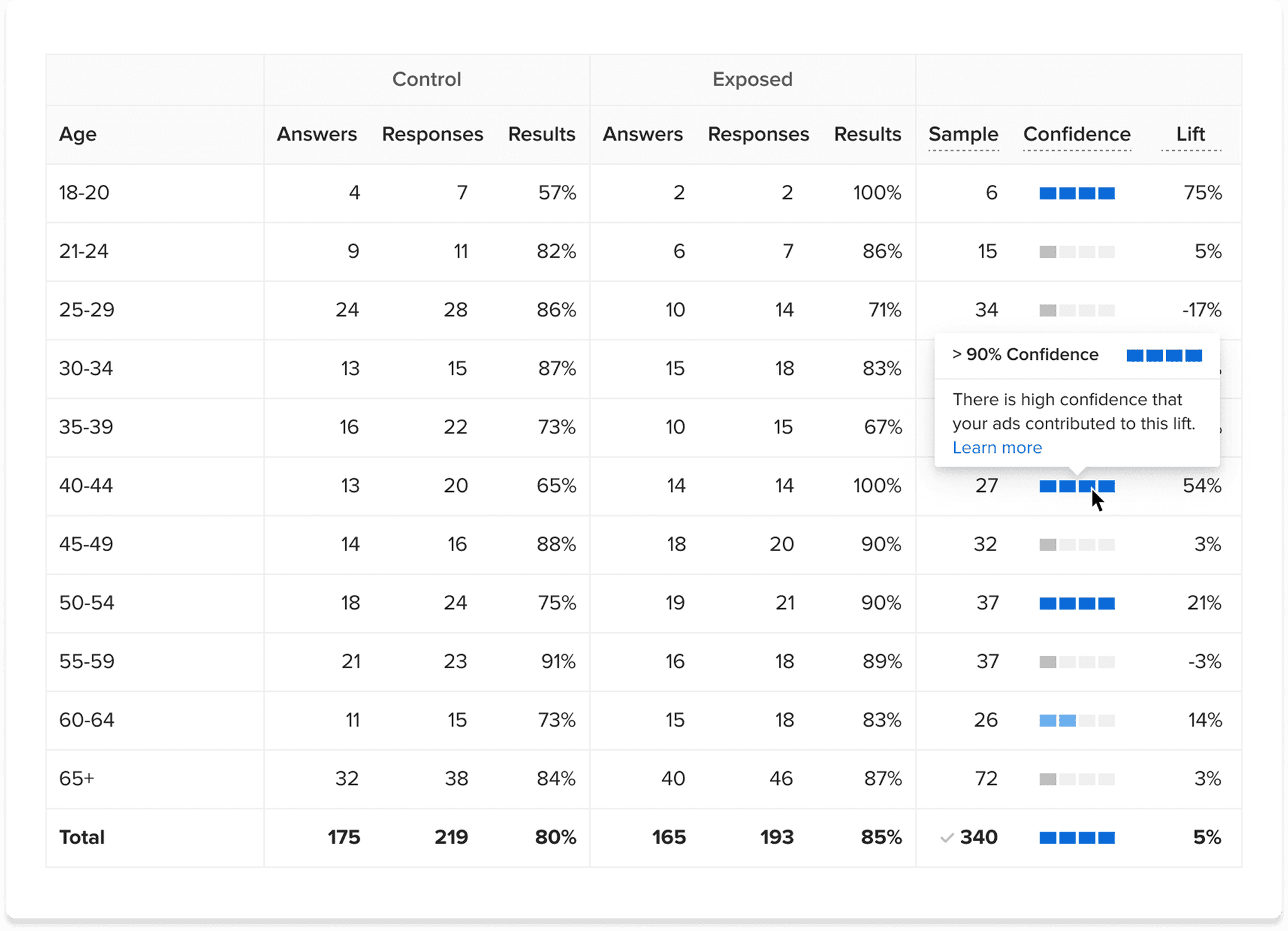
I didn’t want to only rely on color and segmenting to communicate how sample size impacted confidence, so I developed a tool tip with copy explaining the connection:
Result: a consistent language to communicate lift, confidence, and significance
Internal user testing confirmed that our client success team, who was responsible for supporting our clients in understanding the data, was able to successfully navigate and interpret our brand lift data visualization.