Primary Health Redesign
Primary.Health was a tool rapidly built during the COVID-19 pandemic to schedule and report test results and mass vaccination efforts.
After the pandemic, Primary had a frankenstein-functioning clinic app that required 100% account management for set up, and maintenance.
This project was a behemoth effort to consolidate a fragmented tool and streamline flows into a cohesive, sustainable, and scalable community clinic platform.
Lead designer & PM
Primary Health
Web application
Strategy, design
Challenge
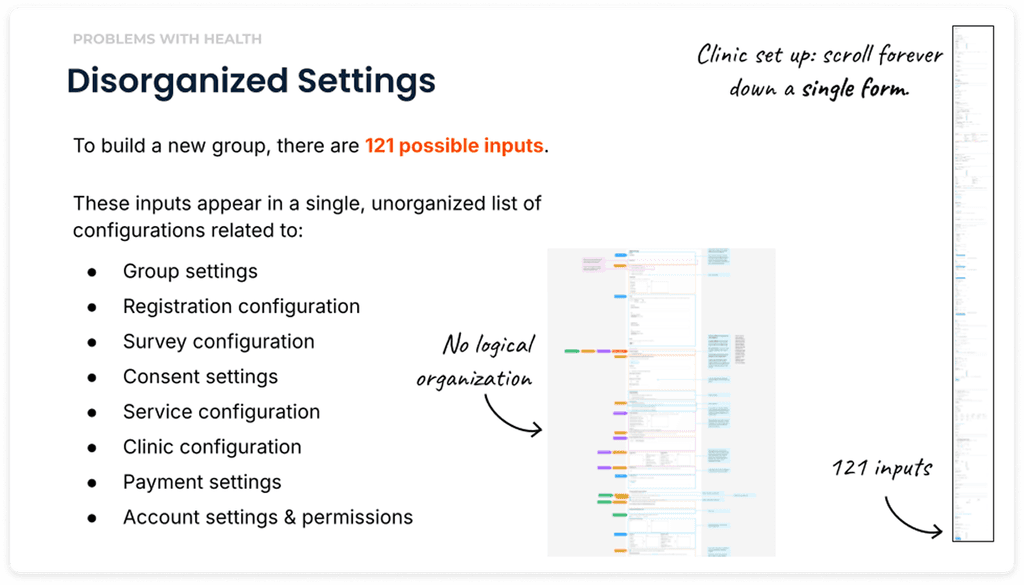
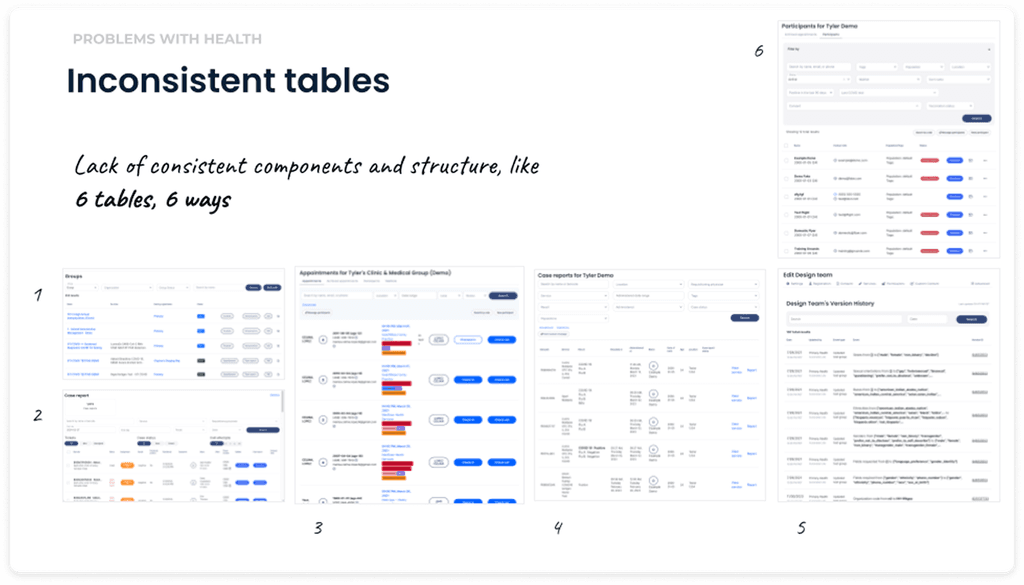
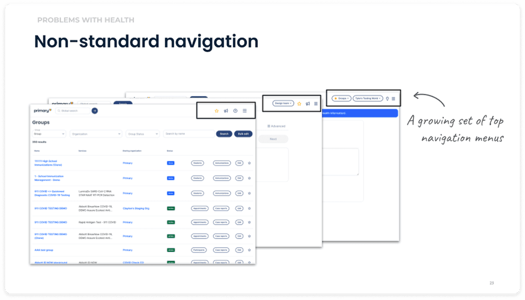
The app information architecture was cluttered, fragmented, and bloated with defunct settings, making it difficult for users to navigate and execute basic tasks. Primary was spending a ton of money on account management and support hours, as clients were unable to use the app independently. My main goal was to increase client self-service. I planned to streamline the information architecture to match user flows, standardize the UI, and update critical UX copy.
Results
The redesigned app features a clean, clutter-free interface, making it easier for users to navigate and access essential features.
The improved clinic setup process resulted in a 40% increase in user independence in the first round of testing.
The standardized UI and UX copy increased user confidence by 4X, paving the way for independent exploration and problem solving.
40%
Increase in user self-sufficiency
4X
Increase in user confidence
33%
Reduction in settings bloat
Problem
Frankenstein functioning: Because the product was built during the pandemic, set up and configuration was disorganized and difficult to follow.
The UX was essentially a bunch of disorganized lists with inconsistent copy, where you kind of had to know where to find things and what various labels meant.
Primary Health was spending a lot of money in client support hours to set up and maintain clinical programs on the platform.
Research & Analysis
I conducted user interviews, cooperative card sorts, and analyzed product usage and customer support data to understand how post-pandemic users were setting up programs on the platform.
A key goal was to understand which functionality was still needed in a post-pandemic product offering.
I used Dovetail to organize and synthesize qualitative interviews.
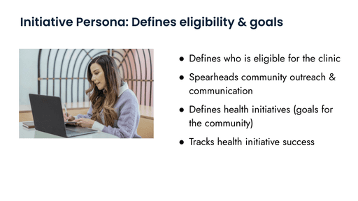
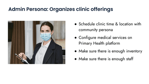
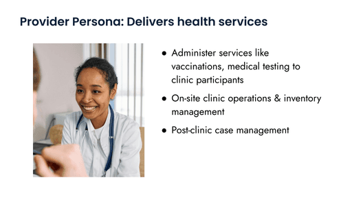
Defining personas
Through my interviews, it became clear that there were distinct organizations involved in running a clinic, that had gotten sort of mashed together across the platform as it was hastily built in the emergency of the pandemic:
Community Persona
Medical Personas
Defining task flows
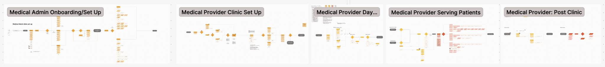
Alongside our personas, I wanted to understand who was responsible for what across the entire clinic journey, from set up to day of to post-clinic tasks. I co-designed these workflows alongside internal clinic managers who works with all three personas to execute
Community Persona task flows:
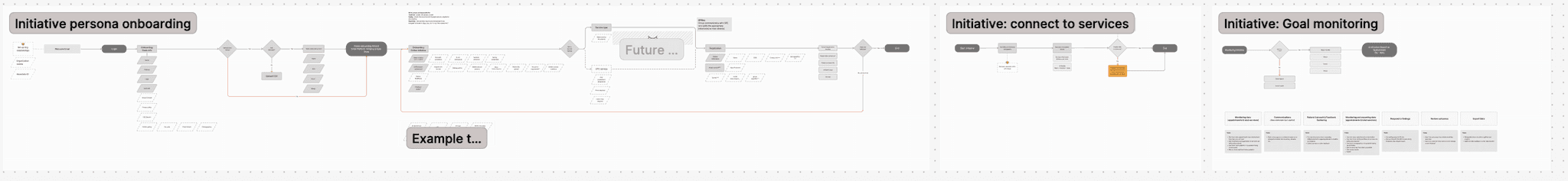
Medical Persona task flows:
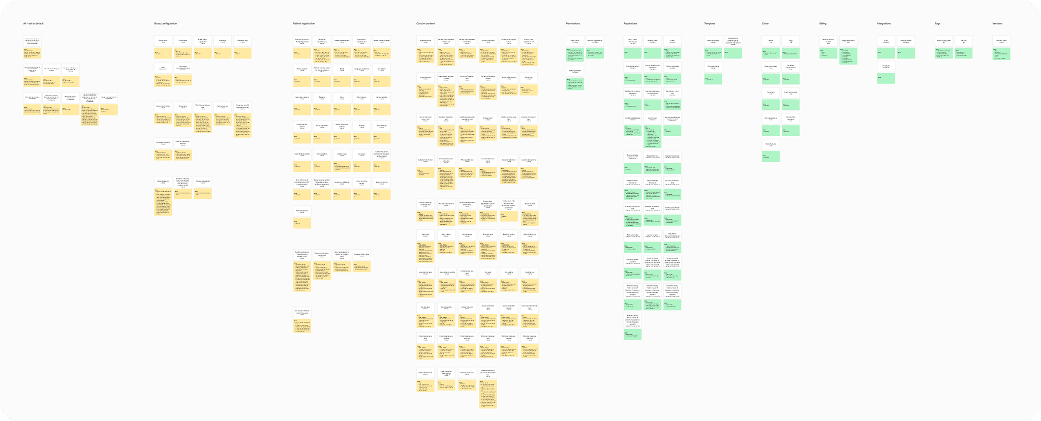
Settings audit & card sort
Now that we had clearly defined personas and task flows, it was time to look at our existing platform to audit and organize what we had. I conducted this sort with both internal and external users.
Designs
So much of this effort required us to balance the tension between customization and standardization. The platform’s flexibility was a major reason we were able to win contracts; but it also created redundancy, confusion, and frequently broke our data reporting.
Another major challenge was fine-tuning which pieces belonged as self-service controls, and which settings needed to remain under Primary’s administrative control. While we had initial determinations from our settings audit, we found that our stakeholders needed to see and feel the designs to realize which configurations were truly suitable to a self-service experience.
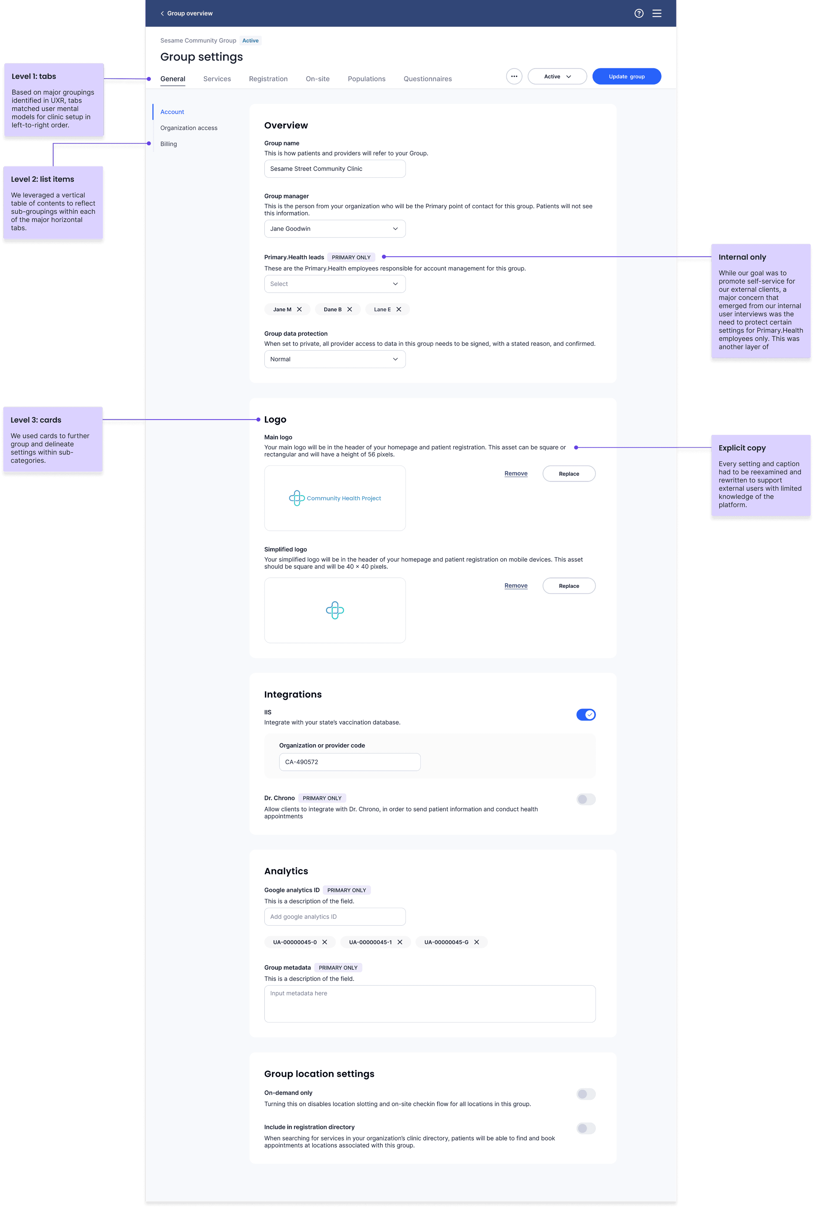
General Clinic Configuration
For our initial roll-out, we decided to organize settings pertaining to both initiative & medical personas within the same clinic interface. We decided this because, at least for the time-being, Primary's internal account managers were still managing and supporting clinic configuration for our external clients, and dividing the tasks into two separate flows would create more work for our support team.
Our goal was that these new designs would increase external client independence and self-service, slowly reducing the cost of client management over time.
I segmented and grouped settings based on my research so settings were grouped based on persona and taskflow.
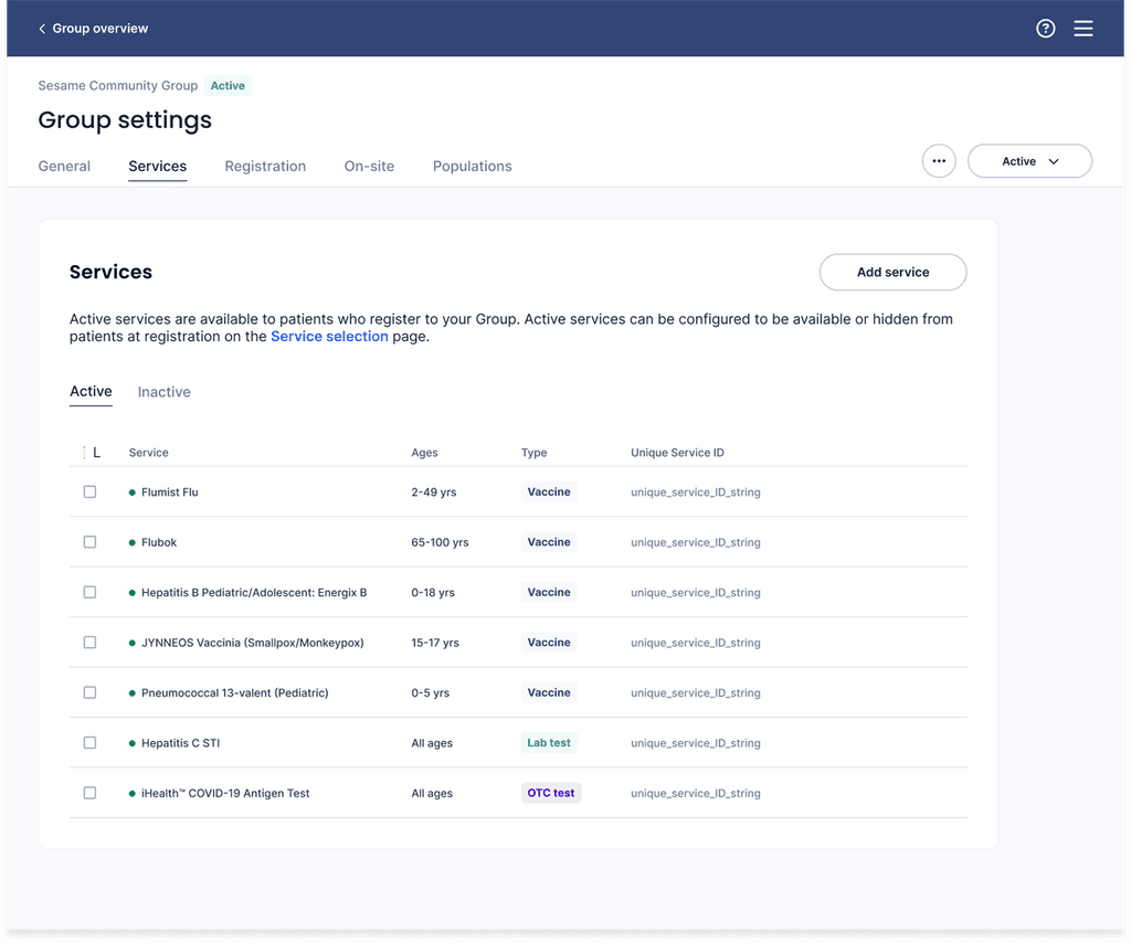
Clinic medical services
Through UXR I discovered it was important to users to be able to quickly view the services a clinic offered, including some defining characteristics like the age-range for each service, the type of service (e.g. vaccine or test) and the unique service ID, which was used for state and federal reporting.
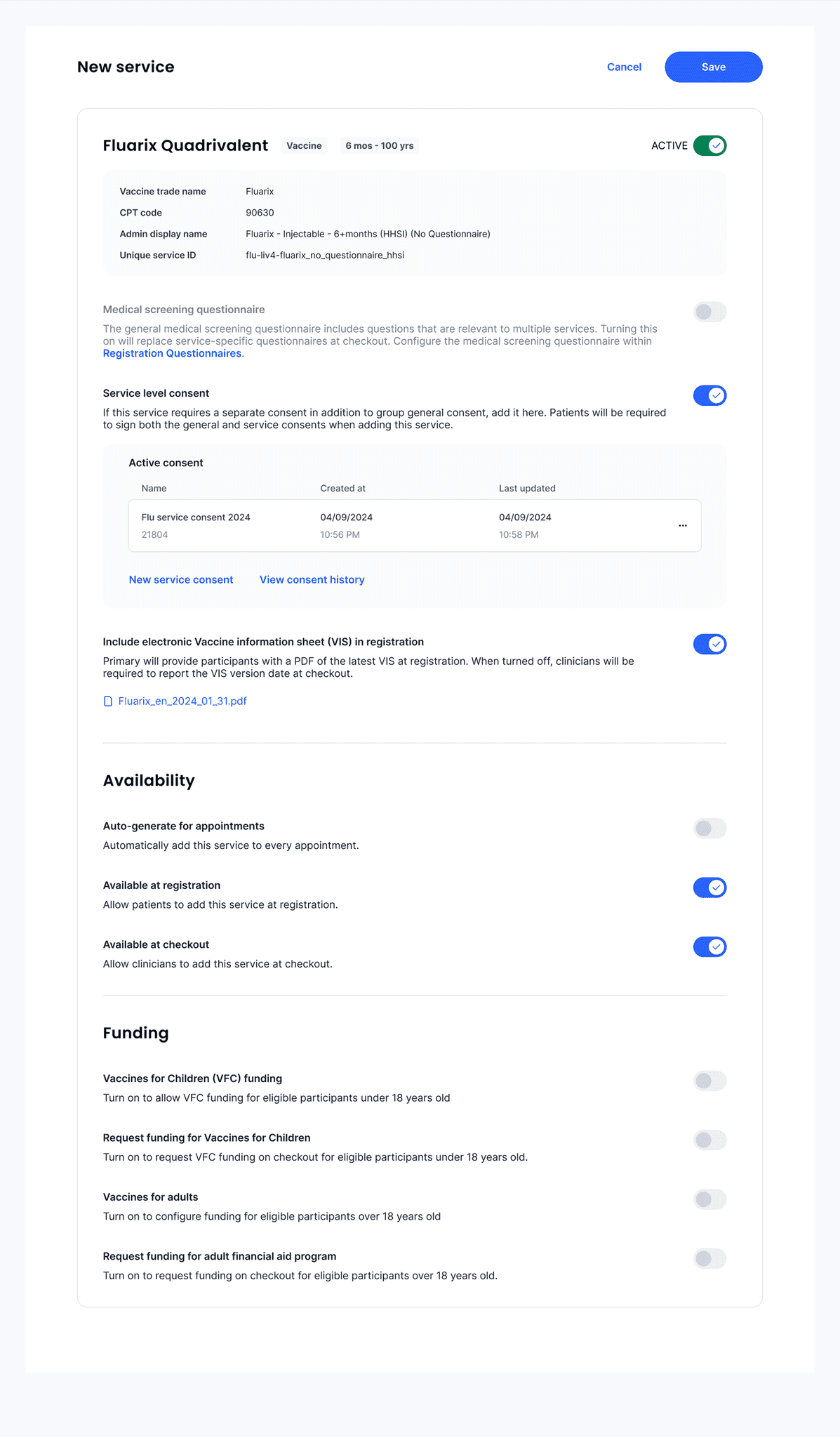
New service configuration
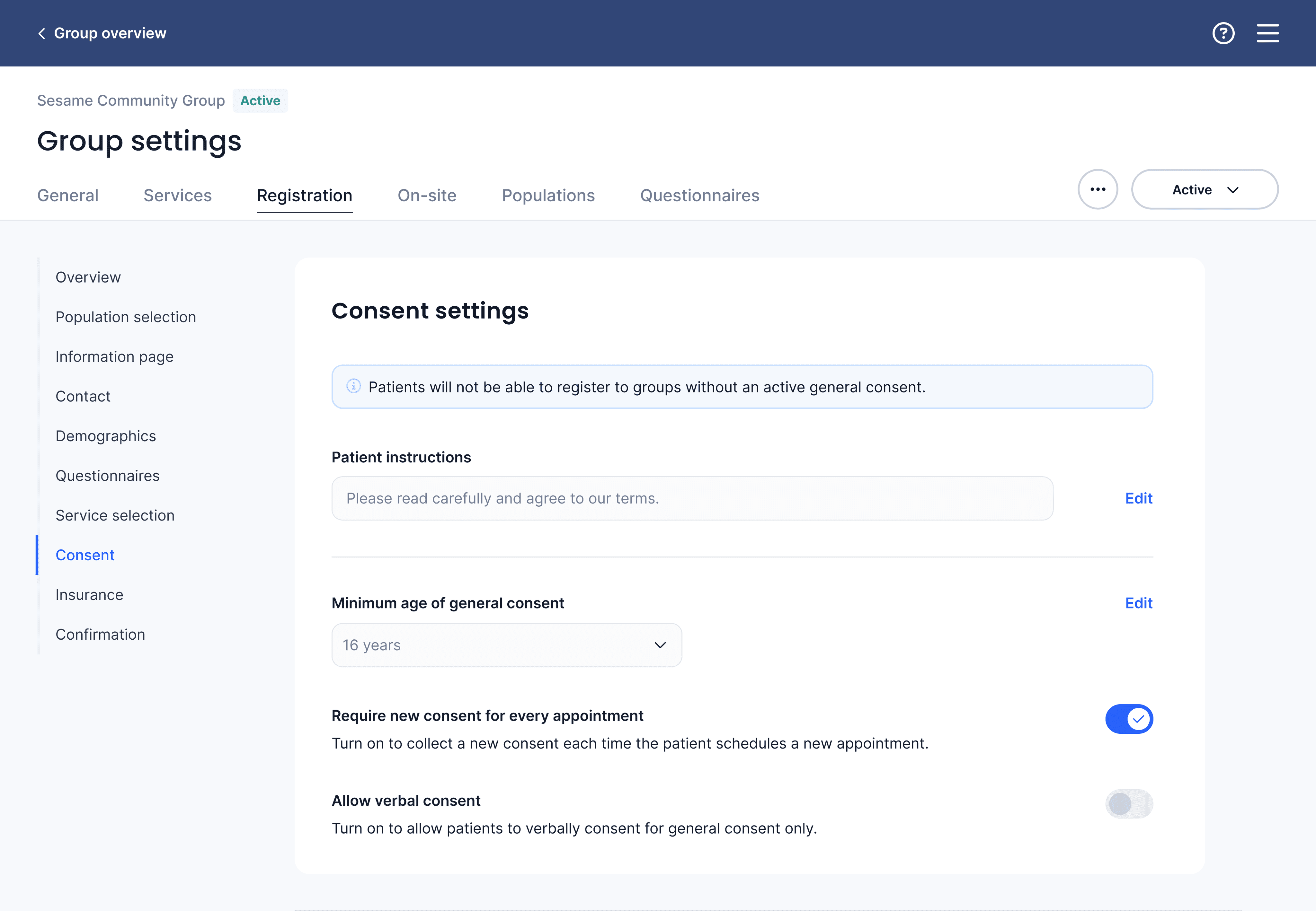
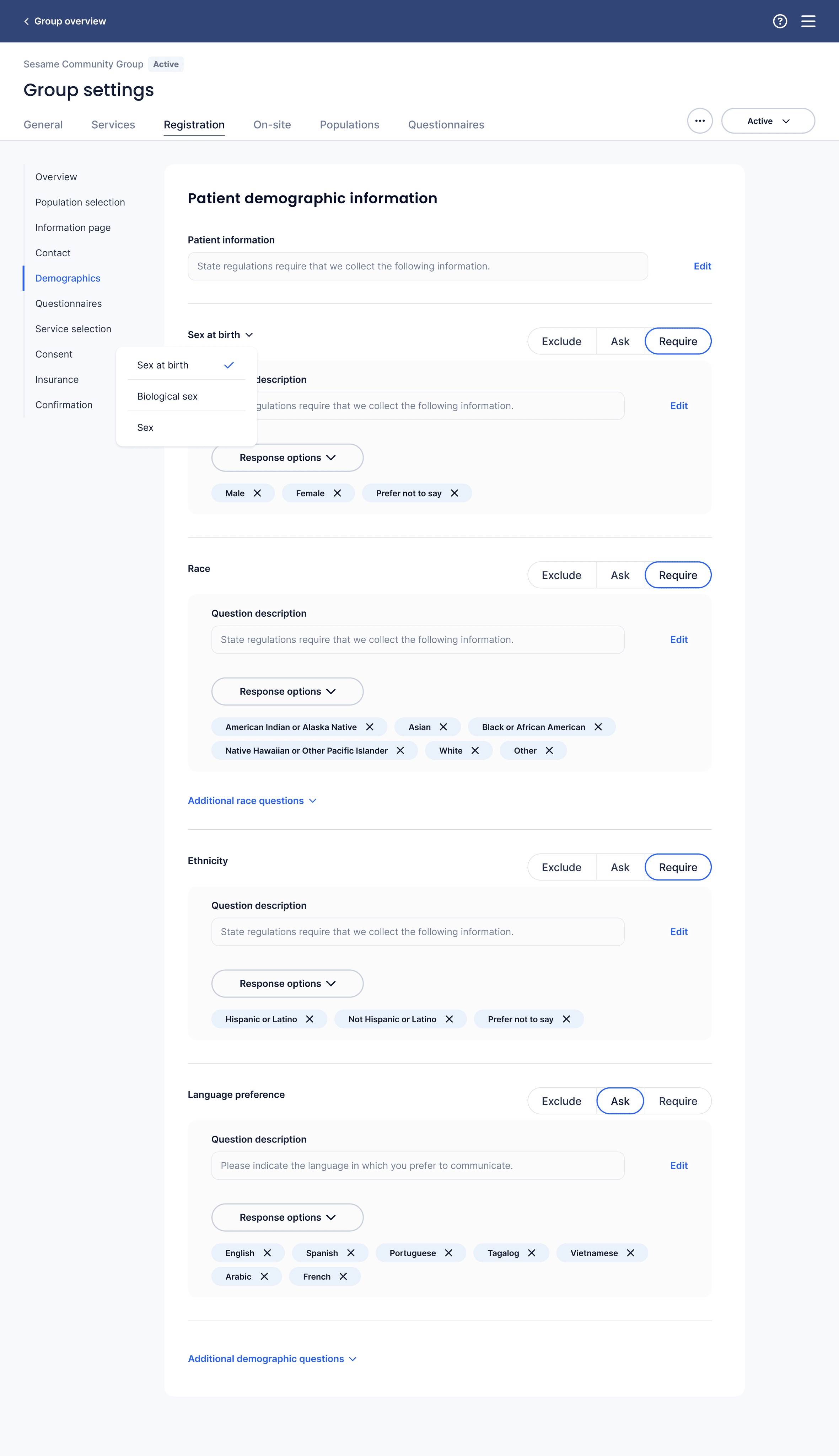
Patient registration configuration
Patient registration would be configured by both the community and medical personas; the community persona wanted to configure things related to their program initiatives, like demographic information, while the medical persona wanted to configure steps related to administering medical services, like medical questionnaires, insurance, and consent.
I designed the set-up to match the patient experience, which meant different personas would configure different pieces of the set up. I did this for two reasons:
Matching set up of the patient experience to the actual patient experience matched users' mental models in UXR
Primary's internal account managers were still managing and supporting clinic configuration for our external clients, and dividing tasks into separate flows would create more work for our internal team.
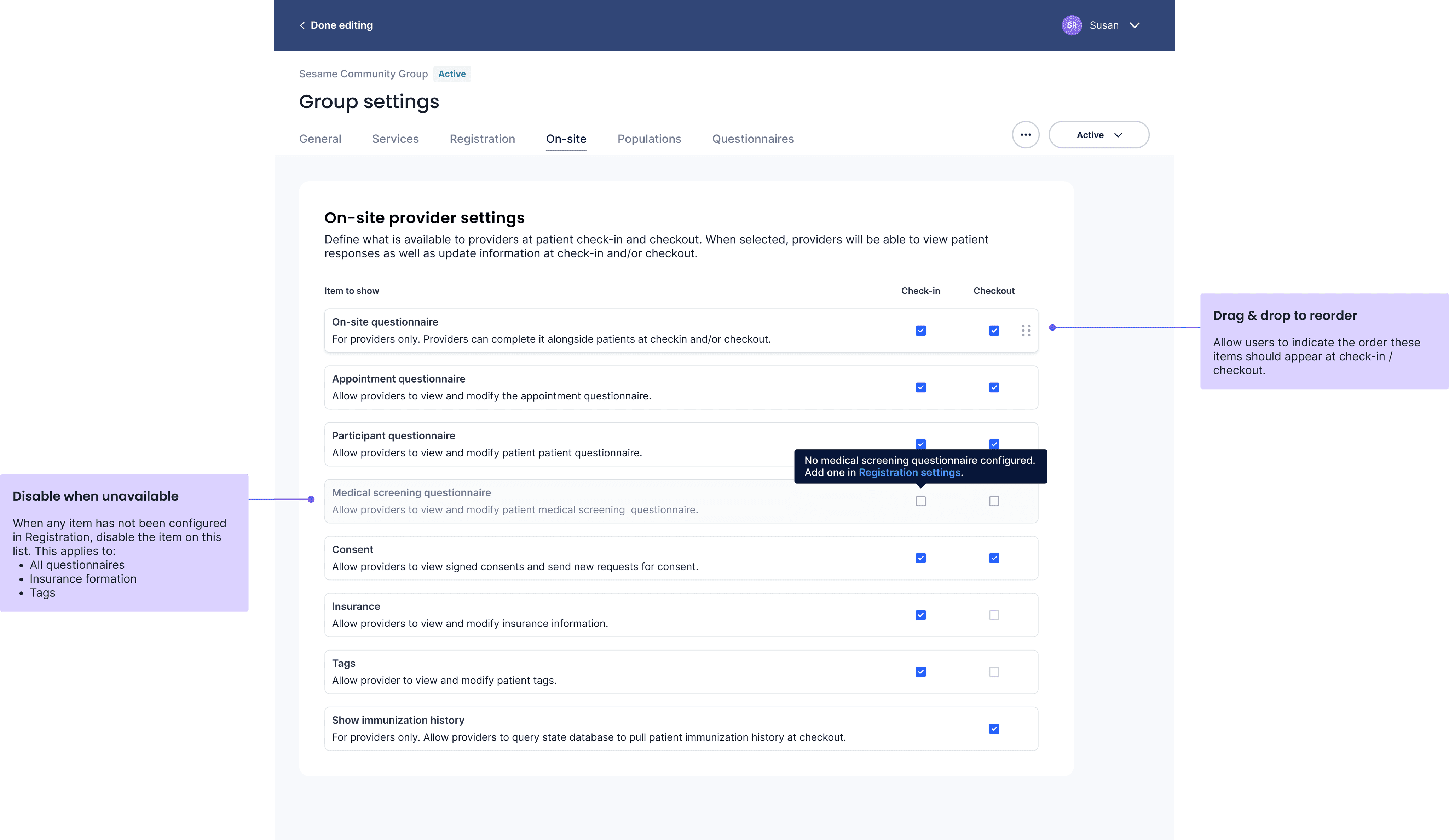
On-site settings
One challenge was designing an easy-to-understand interface for what would be visible to patients or to medical providers at patient check-in and patient check-out.
While early designed configured this visibility setting with each item as it chronologically appeared in registration, through UXR I realized that both internal and external users thought about the check-in and check-out process as a separate configuration, and wanted to be able to make decisions about what appeared at check-in and check-out after they'd configured the various components that might be available there.
So I designed a separate "on-site" tab that reflected users' mental model to make these choices after their content had been set up and configured.
Results: A giant step toward self-service
Unfortunately my position was eliminated before I was able to see these designs implemented, however, I did conduct user research to validate user independence and confidence in successfully completing major tasks involved in setting up a new clinic.
In my final research sessions with external users, nearly all users were able to successfully complete the top 5 critical tasks tied to clinic set up (and a significant chunk of customer success tickets).
All users reported a significant increase in confidence in their ability to make the most common changes to their clinic without first contacting customer success.