Learning experience design for a
story-based mnemonic device

My very elegant mother just sat upon nine pizzas.

We use mnemonic devices to help us remember abstract and unfamiliar information. How might we create a mobile learning experience featuring story-based memorization?

Learn with the prototype >>

Background

LEARNING EXPERIENCE DESIGN

Polyhooks is a tiny company building a learning app with a unique way of teaching foreign language vocabulary. It's based on the idea that you can quickly learn a bunch of words when they’re tied to memorable stories.

My background in education and the fact that I was living in Brazil, desperately trying to learn Portuguese made this project particularly compelling for me.

This case study explains how I designed the app’s core word-learning experience.

MY ROLE
I owned the entire UX process from ideation to delivery.  
TIMELINE
2 weeks
TEAM
Founder (Product)
App developer
Me 🤘

Understanding the problem

WHAT'S A MEMORY HOOK?

Polyhooks is not the next Duolingo. It’s mainly focused on vocabulary building. The program uses a short story called a “memory hook” to help learners remember unfamiliar words.

But how would this work as an app? Instead of a one-to-one word-definition relationship, learning each word involves four relational pieces: word, definition, story, and image.

How might we design a simple user experience for using a mnemonic device to remember new vocabulary?

EXAMPLE:
Vietnamese word: mưa
Meaning: rain
Memory hook:
Seeking relief from the summer sun, the cow lets out a nice “moo-ahh” when it starts to rain.
What makes Polyhooks unique also makes it tricky to design.

Research

COMPETITOR ANALYSIS

In addition to gathering industry insights, I was curious to see if I could find a langauge program that used mnemonics like Polyhooks.

While some products like Drops were vocabulary-focused, our story-based memory device was unique.

PRODUCT DEEP DIVES

Even though Polyhooks didn’t look like anything on the market, there was a lot to be learned from analyzing the apps out there.

I spent a lot of time looking at language apps 😅.
After many hours and lots of progress in my personal Portuguese learning, I developed a set of rules:

  • Keep the user engaged. There was a user action on almost every screen.
  • Celebrate success. Learning should focus on successful attempts rather than highlighting errors.
  • Bite-sized is best. New information should be presented in small, digestible pieces.
  • The simpler, the better. Screens should be free of distractions and focus the user on the learning objective.
  • Goal-oriented. The user should always be working toward a clearly defined goal or endpoint.
DUOLINGO
One of the many maps I made during the process
I internalized so much (consciously and subconsciously) during my app deep dives!

Ideation

SKETCHING & WIREFRAMING

I worked with the  founder to understand the Polyhooks word-learning sequence. With the Polyhooks method, each word is taught in four steps:

1. NEW WORD
Vietnamese word: mưa
Meaning: rain
2. HOOK
Vietnamese word: mưa
Hook: “moo-ahh"
3. "SCENE"
Seeking relief from the summer sun, the cow lets out a nice “moo-ahh” when it starts to rain.
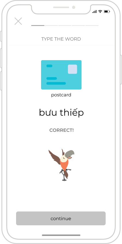
4. "QUIZ TEXT"
_ _ _

Type the word.
I sketched out screens based on the four steps:
WIREFRAMES

After reviewing my sketches with the founder and developer, I designed a wireframe prototype so that we could test the designs.

1. NEW WORD
The idea behind making this multiple choice is engagement; it’s not about getting it right or wrong.
2. HOOK
The Vietnemese audio for “bưu thiếp” plays when flipping this card. (Spoiler: it sounds a lot like the English word “boutique.”)
3. SCENE & SUMMARY
We weren’t sure whether the hook or scene should come first. My idea was that seeing the hook first would “prime” the learner to receive the scene. This was something we’d evaluate in user testing.
4. QUIZ
The “quiz” is not really a test; it’s another opportunity for the learner to internalize the new word.

Prototype learnings

TESTING & ITERATION

I created a working prototype and set out to answer three main questions:

  • Can users accurately describe the product?
  • How long does it take to reach the “aha” moment?
  • Can users keep all of the variables straight?

I tested the wireframes with 5 people who had never studied Vietnamese, but who had studied a language before.

Nearly every test session had a moment when users recognized the mnemonic device, acompanied by a vocal “ahhhhh!” Hence, the “aha” moment.
INSIGHTS
Everyone could accurately describe Polyhooks. YAY! However, the “aha” moment didn’t come until the second word for most users. I was determined to get it on the first word.

Learners struggled to keep track of the variables.
I tested bold and colored variables, but user testing confirmed that we would need to label each variable.

Variable iterations
Confusing scene to summary progression. I was asking users to make a big final leap to connect the memory hook with the vocabulary word. I modified the transition from scene to summary to create clear links between ideas.
“It feels kind of long.” Users had to complete four steps and six screens to learn one word.

My original progress bar displayed session-level progress (e.g., you’re on the first of five words). Testing revealed that we also needed to display word-level progress.
Final dual-progress design

Testing final designs

HIGH FIDELITY PROTOTYPE

I created hi-fi designs and re-tested with new users. I was looking for two key improvements:

  • Do users understand the mnemonic device on the first word?
  • Can users easily follow the sequence and keep track of the vocabulary word, its meaning, and the memory hook?

The short answer? YES!

100% of users achieved the “aha” moment on their first word, most of them on the summary screen in step 3.

Adding labels eliminated user strain to remember each variable, and by the third word users moved quickly and confidently through the flow. As a bonus, 100% of users could remember the Vietnamese word for postcard after a 15 minute delay.

USER QUOTES:
This is such a non-intimidating, welcoming way of learning.
This would be great to learn basic vocab when traveling. It links the foreign word to the familiar hook so that you can have an association.
Learn Vietnamese here >>

Reflection & next steps

WHAT I LEARNED

UX copy is everything. Especially when introducing a new concept, clear, direct copy makes a huge difference.

Users arrive with assumptions. Almost all user testers assumed this would be like Duolingo. It took these users extra energy to pivot to understand a new model. How might we make it easier for new users to understand Polyhooks?

User confusion shapes user–product relationship. When it took users longer to reach the “aha” moment, their diminishing confidence fueled skepticism.  When users doubted their understanding, I wondered if they would stick with it if they weren’t in a user test.
NEXT STEPS
01
ONBOARDING
  • “What’s a memory hook?” was the most common quote in testing.
  • It takes a minute for new users to shed their assumptions and appreciate the unique value offered by Polyhooks.
02
WORDS PER SESSION
  • I’d love to run an a/b test to find the sweet spot for the number of new words studied each session.